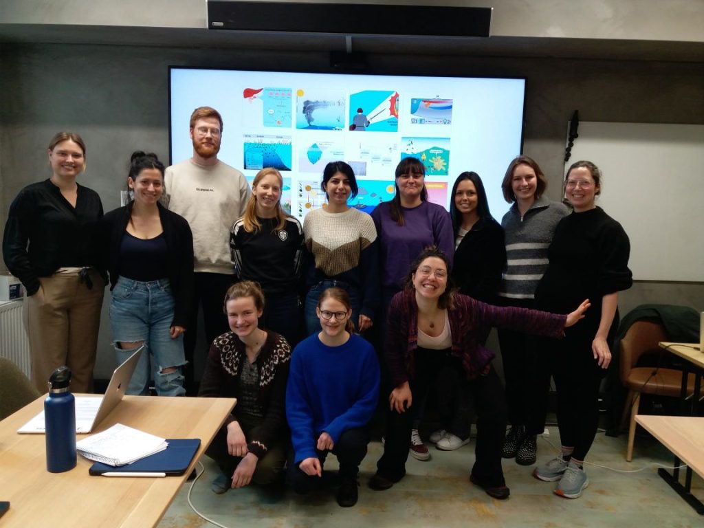
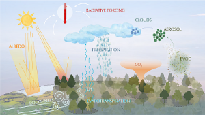
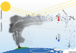
Posters, graphical abstracts, and conceptual figures – these visual representations are the basis for our scientific communication. From the 20th – 22nd of February, a group of 13 PhD students delved into the world of designing science illustrations at the Geophysical Institute in Bergen under the expert guidance of Pina Kingman, an experienced biomedical illustrator and animator.
The primary objective of this course was to equip participants with a set of skills and insights needed for effective concept development, sketching techniques, and mastering digital illustration tools. Prior to the hands-on sessions in the course, all participants familiarized themselves with the online materials covering design theory, principles of producing captivating illustrations and crafted initial sketches for their individual research projects.
Throughout the three days of in-person meeting we had many peer-feedback sessions to improve our drawings. Here, valuable input from fellow students with different scientific backgrounds helped to get fresh perspectives on the drafts. Pina introduced us to various tips and tricks on how to turn raw pencil drawings into polished professional graphics. We have utilized the powerful capabilities of graphic vector illustration software such as Inkscape and Illustrator to finalize the illustrations and applied the gestalt principles of proximity and similarity, contrast, repetition with variation and color theory.
On the last day, we presented and discussed our final work in detail with the group. In summary, the course was a combination of creativity and insights into design theory. We learned how to communicate complex research results in a clear and simple way. It was great to see the variety of stories that the illustrations told.
Text: Nadine Arzt /UiB-BIO
Illustrations: Top left – Adele Zaini /CICERO, bottom left – Christina Brodowsky /UiO-GEO, right – Juliana Tatara /UiT
